Apple’s influence on web design is apparent, even today.
Pioneers of simplicity — and with the company’s website currently ranked above those of other major corporations, Apple.com is today thought to have one of the most well-designed and desirable layouts the web has ever seen.
But it hasn’t always been this way —
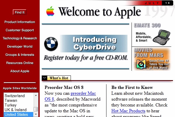
… as this interesting article from webdesign.tutsplus recently highlighted, as it looks back at the web design layouts for Apple.com and how they have changed, often drastically, in appearance from 1996 to present day.
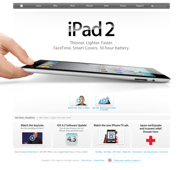
The biggest feature of Apple’s influential web design is its minimalism. Apple keeps it simple by using large areas of white space and big margins to focus on single areas of content.
Apple’s homepage normally features a large product shot with single tagline and some other pages linked under the fold. For example, at the time of writing, Apple features a large image of Apple’s second-generation iPad with a large title and sub headline.
The assumed thinking behind this design choice is the Apple doesn’t want to push everything onto you at once. Instead, they want you to click through to the individual product page where they can show off more information. Take this approach in contrast to Microsoft’s homepage. Microsoft also has a large featured image but the page is cramped with multiple ads and the highlights at the bottom are even harder to read.
More at webdesign.tutsplus
[h/t @stephenou]