Apple Music appears to be getting a new logo.
And, well… this is different.
The familiar Apple Music mark has been stripped back, with the classic Apple logo now sitting alongside a lowercase “music” wordmark. Gone is the familiar capital M — replaced by something much softer, simpler and considerably more modern.
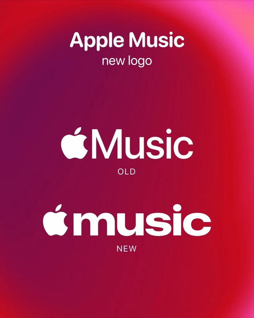
It’s a small change on paper, but logos have a funny way of making an entire service feel fresh again.
The new mark also feels very much at home alongside Apple’s increasingly minimal visual language, while keeping the instantly recognisable Apple silhouette front and centre.
The lowercase treatment is the headline here. It gives Apple Music a much more relaxed, contemporary personality — and makes the old logo suddenly look very 2015.