I sometimes think we underestimate just how good the original iPhone icons were.
Not because they were technically complicated. Quite the opposite. They were small, instantly recognisable pieces of design that somehow managed to give an entire operating system a personality.
This was the golden age of skeuomorphism — when digital things were deliberately made to resemble things from the physical world.
And Apple was exceptionally good at it.
When icons looked like things
The original iPhone didn’t try to hide the fact that its software was new.
Instead, Apple made it feel familiar.
Notes looked like a notepad. Calendar looked like a calendar. Compass looked like a compass. Contacts resembled a physical address book. Even the old iPod iconography carried the visual language of the objects we’d been using for years.
That was the genius of skeuomorphism.
You didn’t have to understand the technology behind an application. You could recognise the object it represented.
Apple’s design philosophy was essentially saying: you already know what this is.
And that made the iPhone feel incredibly approachable.
The icons had texture, depth, reflections and shadows. They weren’t merely symbols sitting on a screen. They looked almost tangible.
Then developers got creative
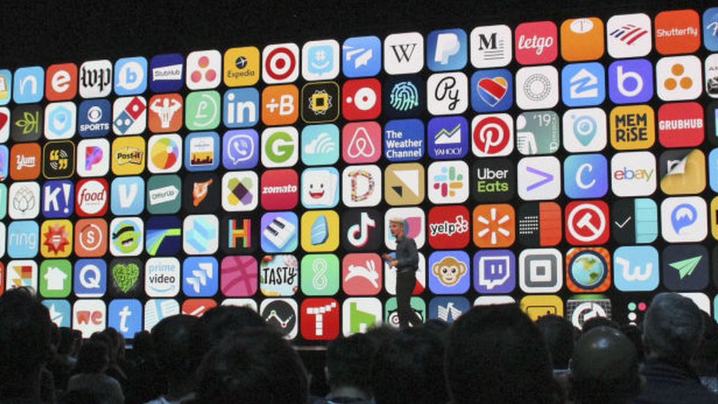
When the App Store arrived, that philosophy spread far beyond Apple’s own applications.
Developers suddenly had a tiny square of their own to design.
And they went for it.
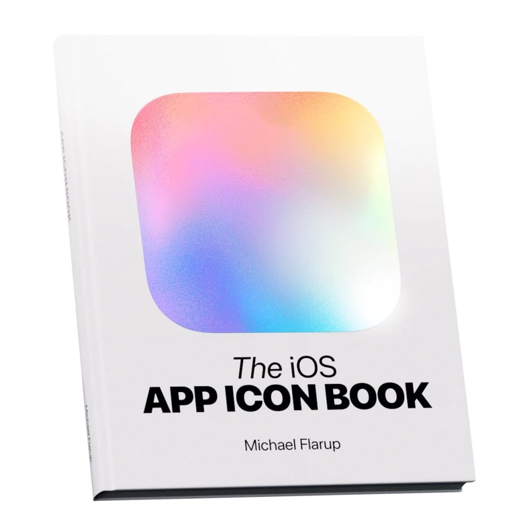
Some icons looked like miniature objects. Others were beautifully illustrated. There were glossy surfaces, dramatic lighting, rich textures and ridiculous amounts of detail packed into something that was ultimately only a few dozen pixels across.
It was glorious.
There was no obsession with making everything perfectly flat.
There was no fear of a little visual excess.
An icon could be playful, tactile and slightly ridiculous — and that was precisely what made it memorable.
The best ones didn’t feel like corporate branding.
They felt like artwork.
This was the world that inspired me
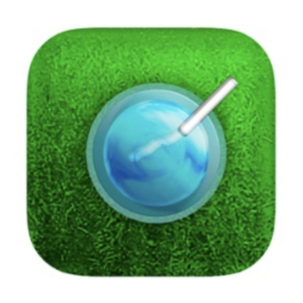
That period had a huge influence on me and eventually fed directly into RFlyGD, my own app icon design studio.
I loved the challenge of taking an entire application and trying to express its personality through one tiny square.
Skeuomorphism made that especially interesting.
You could turn an abstract idea into something physical. A service could become an object. A utility could become a tool. A complicated application could suddenly make sense because its icon gave you a visual metaphor.
And then there were all the little details.
The highlight on a piece of glass.
The shadow underneath an object.
The texture of leather.
The reflection on a metallic surface.
The tiny imperfections that made something feel less like a computer graphic and more like a real object.
You could obsess over those details.
I certainly did.
Apple made the difficult look effortless
Looking back at Apple’s original icon set, what strikes me most is how cohesive it was.
Skeuomorphism could easily have become visual chaos.
Instead, Apple established a remarkably consistent visual language.
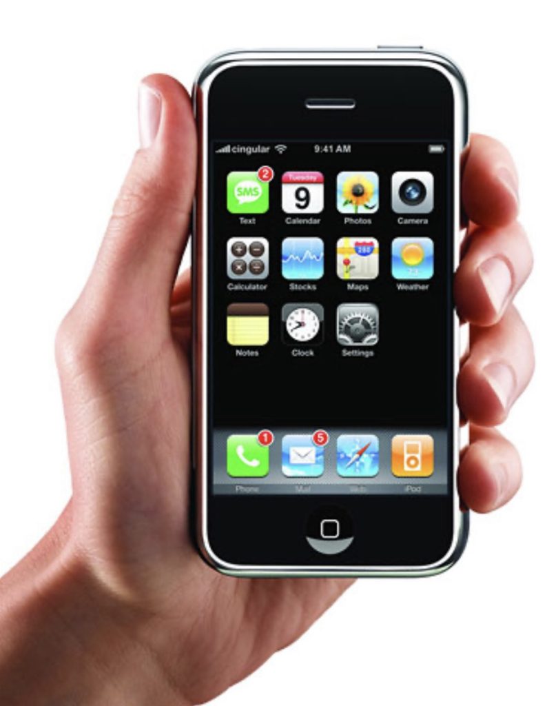
The icons weren’t identical, but they felt like they belonged together.
There was a shared approach to lighting, perspective, materials and colour. Familiar objects were exaggerated just enough to work at a small size, while still retaining their identity.
It was incredibly considered.
And importantly, the design wasn’t there simply to show off.
It served a purpose.
The iPhone was introducing millions of people to a new kind of computing. Making the interface resemble the physical world gave people something to hold onto.
The technology was revolutionary.
The visual language was familiar.
That was a powerful combination.
And then we flattened everything
Eventually, skeuomorphism fell out of fashion.
Interfaces became flatter. Textures disappeared. Shadows became subtler. Buttons stopped looking like buttons. Icons became simpler, cleaner and more abstract.
There was a good reason for that shift. Digital interfaces had matured, and users no longer needed a leather-bound notebook to understand what a notes application did.
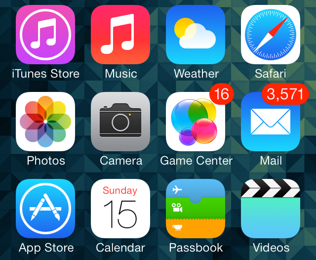
But somewhere in that transition, I think we lost a little of the fun.
Modern icon design can be incredibly sophisticated, but it often feels like it is trying to disappear.
The old icons wanted you to notice them.
They wanted to be looked at.
They were allowed to have personality.
The strange thing about timeless design
You might expect something as visually distinctive as an early iPhone skeuomorphic icon to look hopelessly dated today.
Some do.
But the really good ones don’t.
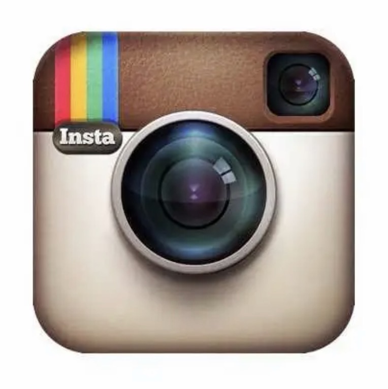
Because underneath all the gloss and texture were timeless principles: strong silhouettes, clever visual metaphors, carefully considered colour, contrast, proportion and an understanding of how something would look at a tiny scale.
The technology changed.
The design fundamentals didn’t.
That’s why me or you can look at an old iPhone Home Screen today — and still immediately recognise the icons.
They weren’t designed merely to follow a trend.
They were designed to communicate.
I think that’s what I miss
I don’t necessarily want every modern app icon to return to leather textures and glossy buttons.
Skeuomorphism had its moment, and modern design has its own strengths.
But I do miss the care that was so visible in those early icons.
There was something wonderfully excessive about spending hours making a tiny digital object look beautiful.
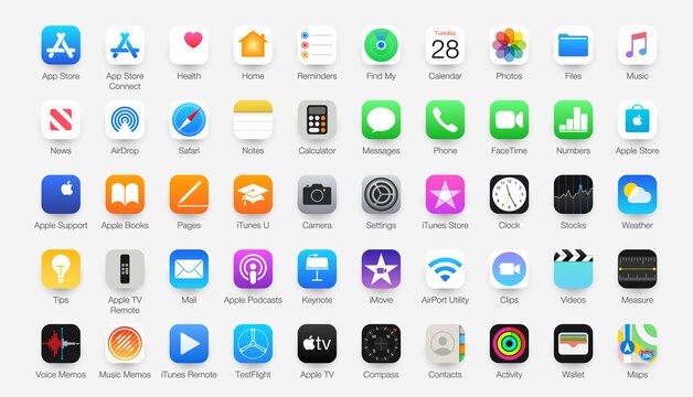
Something satisfying about seeing an icon and immediately understanding the idea behind it.
And something incredibly satisfying about opening a new app and finding that its icon looked like it belonged on the same Home Screen as Apple’s own work.
That era had a visual personality all of its own.
For me, RFlyGD will always be tied to that period — a time when app icon design wasn’t an afterthought, but a genuine part of the experience.
Before icons became symbols, they were little objects. And for a while, those little objects made the iPhone feel magical.
… and maybe that was enough.