There’s a surprisingly easy detail to miss when comparing the iPhone Duo with other foldables: Apple didn’t just make the screen bigger. It moved the furniture.
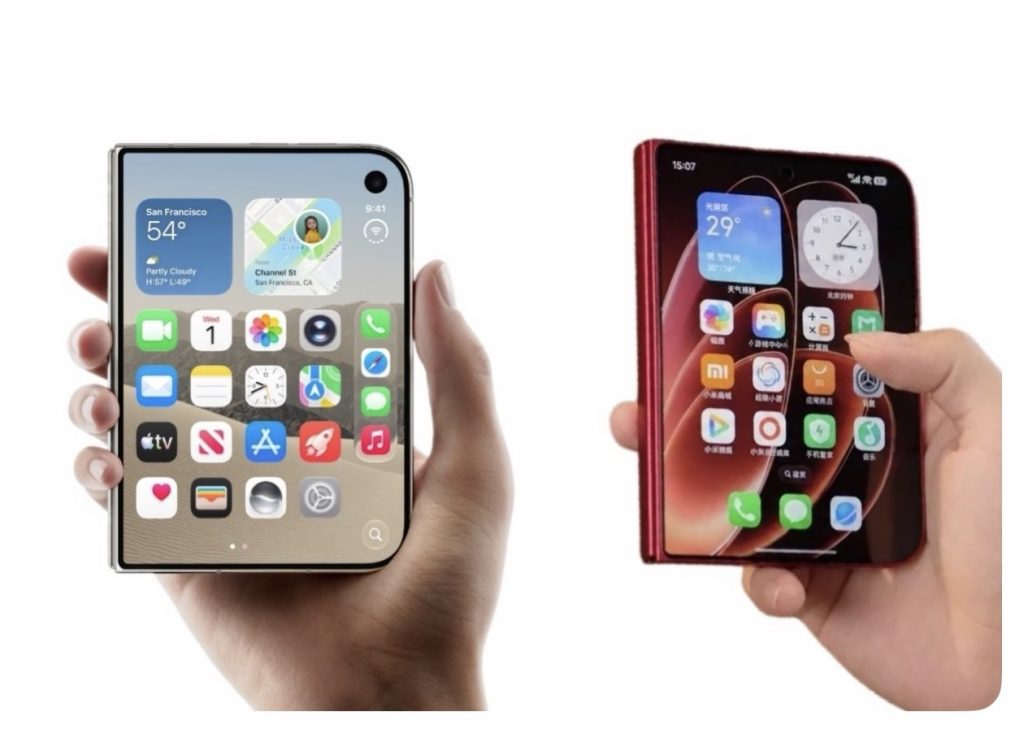
Take the Dock, for example.
On the iPhone Duo, iOS 27 moves the Home Screen’s Dock from its traditional position at the bottom of the display and places it vertically along the side. Apple has also moved navigation and other essential controls to the side, freeing up more of that unusually tall display for actual content.
And then there’s the Xiaomi 18 Fold.
Xiaomi — one of the company’s biggest foldable competitors — has built a very different interpretation of the same basic idea: a wide, book-style foldable that becomes a large canvas when opened.
HyperOS 4 brings plenty of foldable-specific multitasking features, including multiple app layouts and floating windows. (tech-ish)
But the traditional Dock hasn’t been given the same dramatic relocation.
That sounds like a tiny thing.
It really isn’t.
Apple treated the fold as a new interface
The interesting thing about the Duo isn’t simply that the Dock is on the side.
It’s why it’s on the side.
A conventional bottom Dock makes perfect sense on a conventional phone. But open up a foldable and suddenly you’ve got a much wider, taller canvas. Keeping everything anchored to the bottom means you’re continuing to design for the old shape of the device.
Apple instead seems to have asked a slightly more fundamental question:
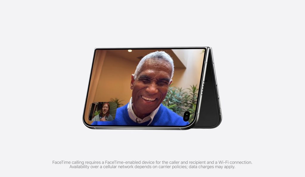
What if iOS stopped pretending this was a normal iPhone?
That’s where the Duo starts to feel different.
Controls move depending on how you’re holding the device.
The interface can adapt when the phone is folded, partially folded, rotated or propped up. Apple even describes the content as reacting to the device as it changes orientation.
The Dock is just one visible consequence of that thinking.
And Xiaomi makes the contrast easier to see
The Xiaomi 18 Fold is hardly a simple foldable. In fact, its software does some seriously clever things with the additional screen real estate.
But putting the two devices next to each other makes Apple’s approach stand out.
Xiaomi has essentially made a very capable foldable interface.
Apple has tried to make iOS behave like it was designed for a foldable — from the beginning.
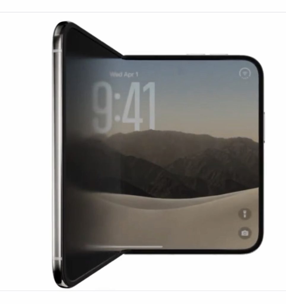
That’s a much bigger undertaking.
And it explains why so many of the Duo’s little touches feel connected: the side Dock, the redesigned status area, the way apps transition between screens, Split View, the way content moves away from the crease and even the behaviour when the phone is sitting on a desk. (MacRumors)
None of those things individually is revolutionary.
Together, they make the Duo feel considerably more deliberate.
The Dock might be the best example of Apple’s care for the finer details
This is why I’ve become increasingly interested in Apple’s decision to move something as perceptibly boring as the iPhone’s Dock.
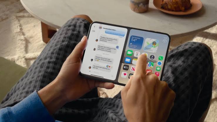
It isn’t flashy.
It won’t sell a $1,999 phone — on its own.
But it’s the sort of decision you make when you’re designing around the shape of the computer, rather than simply putting a larger screen on it.
The Xiaomi 18 Fold proves that you can build a great wide foldable without completely reinventing where everything lives.
The iPhone Duo suggests Apple wasn’t interested in doing that.
It wanted iOS to change and adapt with the physical hardware.
And that’s probably the part of the Duo that other foldable makers should be watching most closely.